
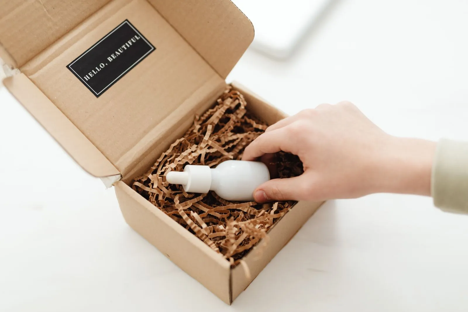
Beauty packaging has a busy job: it needs to draw shoppers in, explain what the product does, and make each item feel like part of the same brand. Those goals can compete when a label has limited space or a product line includes many formulas and formats. Start with a clear hierarchy, choose visual elements that fit your audience, and set rules that work across the full range. A few practical decisions can make packaging more useful on the shelf and easier to recognize.
Make the product easy to notice
Decide what you want shoppers to notice first. It might be the product name, a key benefit, or the brand itself. Give that element the strongest visual treatment through size, placement, contrast, or whitespace. When every message competes for attention, the package becomes harder to scan. A focused design helps shoppers understand the offer quickly, whether they are browsing in person or viewing a small product image online.
Use color, typography, and imagery to reflect the product’s purpose and intended audience. A gentle cleanser might call for a different mood than a bold lipstick, but both should feel connected to your brand. Check the design at actual package size and from a few feet away. Thin lettering, subtle contrast, or intricate details that look elegant on a computer screen may disappear on a small container or crowded shelf.
Keep essential details readable
List the information customers need to choose and use the product, then organize it by importance. The product type and main benefit should be easy to find. Ingredients, directions, warnings, size, and other required details need enough space and contrast to remain legible. Avoid shrinking essential text just to preserve a decorative element. If the package cannot hold everything comfortably, consider a larger label or an appropriate secondary panel.
Plan copy with the package structure in mind. A curved bottle, narrow tube, or small compact can limit where text sits and how it reads. Ask your printer or packaging supplier about safe areas, material, finish, and minimum type sizes before finalizing artwork. Review a printed sample—not just a digital mockup—for glare, smudging, color shifts, and readability. Confirm applicable labeling requirements for the product and market before production.
Create consistency across the line
Build a simple design system before designing every item separately. Define core choices such as logo placement, type styles, color rules, image treatment, and how product names appear. Then use those choices consistently across bottles, jars, cartons, and other formats. A shared structure helps shoppers recognize the brand even when packaging sizes or shapes differ.
Give each product a clear way to stand apart within that system. You could vary one accent color, a product-family label, or a small graphic while keeping the main brand elements fixed. Check the full range together in a lineup, including products that sit next to each other. This makes it easier to spot inconsistent spacing, confusing color differences, or names that are difficult to distinguish.
Test before committing
Before approving a large production run, review a physical proof or prototype. Hold it in your hand, read it under different lighting, and check whether the cap, label, and container work together. If possible, place it beside competing products or mock up a realistic shelf view. Ask people unfamiliar with the brand what they notice first and what they think the product does. Their reactions can reveal unclear claims or overlooked details.
Also check that the design can adapt as the line grows. New sizes, shades, formulas, and packaging suppliers may introduce constraints. Keep organized artwork files and written design specifications so updates do not rely on memory. A flexible system protects recognition while leaving room for useful changes, such as clearer instructions or a new product category.
Strong beauty packaging makes the product easy to spot, easy to understand, and easy to recognize as part of your brand. Set priorities before designing, test real samples, and review the entire product line together. If you’re refining a beauty brand’s packaging, Peach & Polish can help you shape a cohesive design direction.